— PROJECT
Redesigning an e-commerce
website for a video game magazine
— ROLE
UX/UI product designer
— TOOLS
Figma
— DATE
2021
For this design sprint, we had two weeks to redesign the website of JV le Mag, an
e-commerce to buy subscriptions to their magazine.
Our challenge was to make the site more
in line with the personality of the editorial team and to propose a range of subscriptions that would be easier to understand for users.
THE
CLIENT
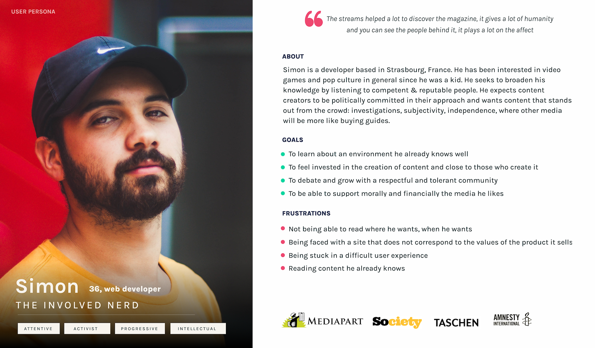
JV le Mag is a video game magazine that was born in 2013, created by a small team with few resources. They offer a wide variety of content in several medias (articles, podcast, twitch lives). They have a very close-knitted community that enjoys their in depth investigations, subjectivity and independence.
Readers appreciate the more in-depth investigations into the video game industry, as well as the magazine’s political subjectivity and outspokenness. The editorial team makes sure to create a safe space opens to all.
Currently, their website is used as an e-commerce site, to buy subscriptions to the magazine and related products. But the range of offers is too confusing, which creates a very low rate of new subscribers and the goodies are not highlighted enough. Moreover, there is very little information about the magazine itself, the editors and the content they create.
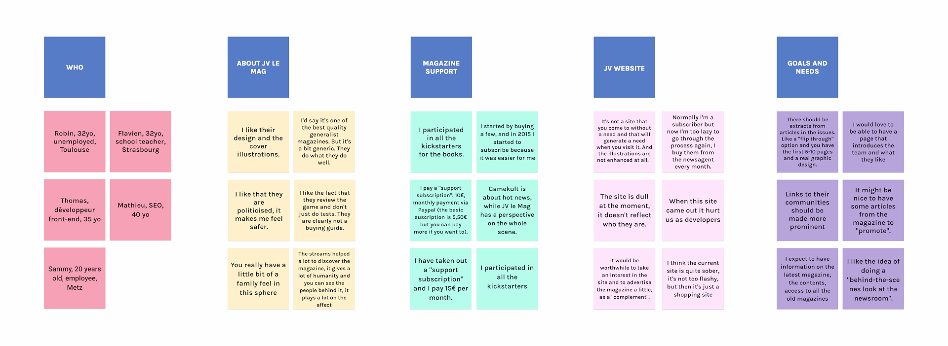
THE RESEARCH
We made a survey that we shared on JV le Mag discord, to find more about the community, 32 persons answered. Almost 80% of the respondents are men between 26 and 39 years old. For the most part, they discovered JV le mag at their beginning through the ZQSD podcast or via social networks. 76% of them have a subscription to the magazine.
We followed our survey with 5 interviews of regular and long time readers. We wanted to know more about their attachment to the magazine and test the actual website with them to see what could be improve.
UI
DESIGN
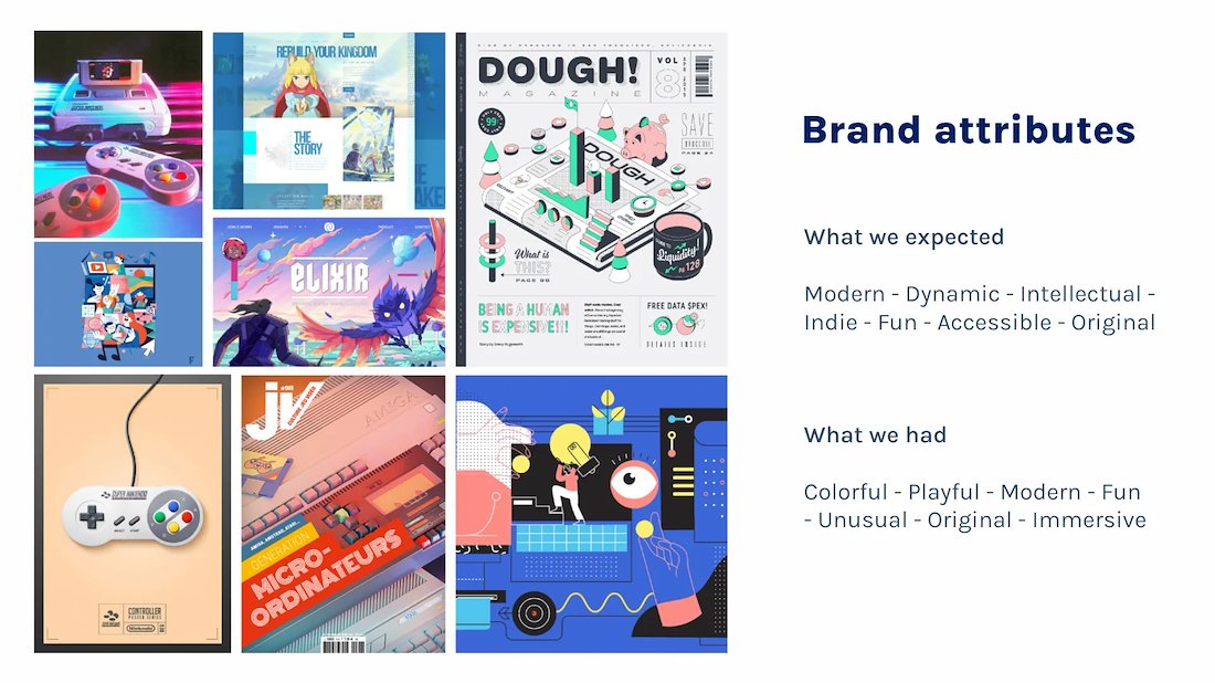
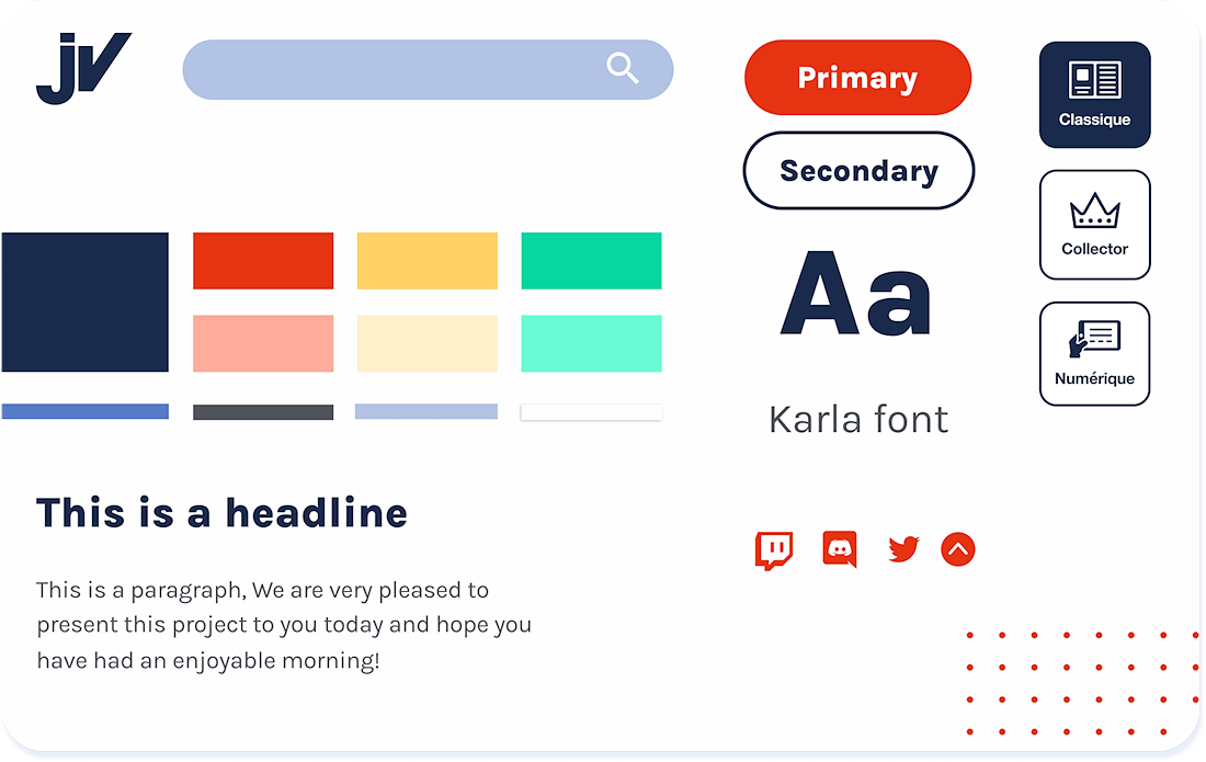
For the style of the website, we opted for bright but yet soft colors, so it can be pleasant to the eye, directly inspired by the colors of a Nintendo controller.
We chose rounded shapes to support the fun and light side of the magazine. To balance that light atmosphere, we picked a rounded but serious and easy to read font, Karla, that goes especially well with magazine articles.
We agremented the rest of the design with some Memphis patterns, to accentuate and highlight the products.
And last but not least, we decided to reserve a special role to the mascot of the magazine, Jean Vidéo, that we tuned a little to suit our brand new design.
THE
SOLUTION
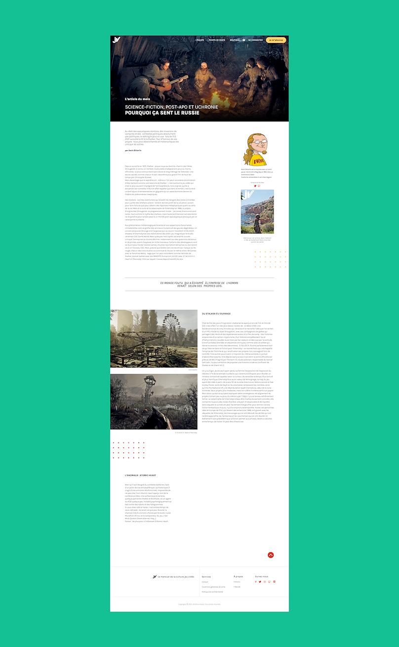
We created a more immersive homepage, with an overview of the team, merchandising and an exclusive free read for potential new subscribers.
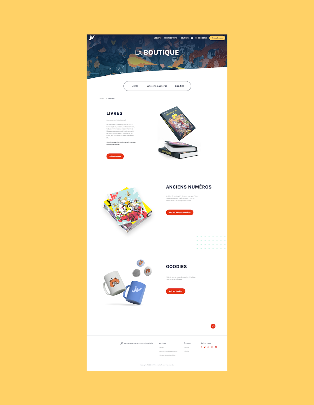
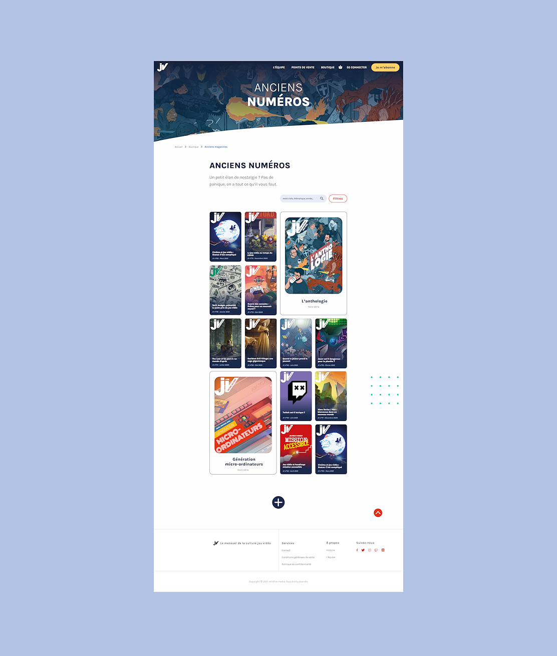
We simplified the e-shop section, creating a grid to showcase past magazines.
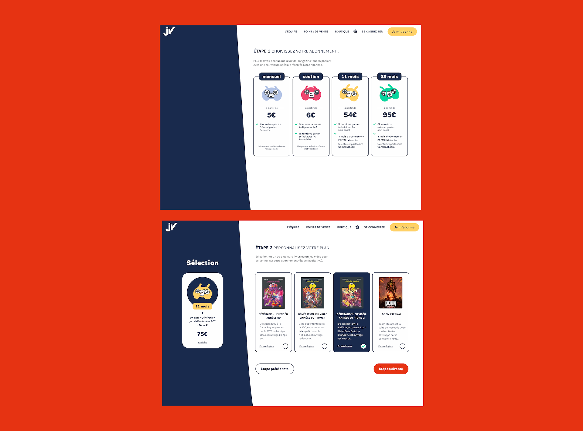
For the subscription, we designed a step-by-step solution. Instead of 11 different options, the user can choose one of 4, then customize it by adding books from JV le Mag.
NEXT
STEPS
We still have a lot to do on this project.
We want to enrich the design system to collaborate more efficiently with the front-end developers and add more of JV le Mag’s own illustration in the different headers.
And finally we would like to take the project to the next level by creating a mobile app.