— ROLE
UX/UI designer
— TOOLS
Photoshop
Illustrator
Figma
Unity
— DATE
October 2022 to today
Disney Dreamlight Valley is a hybrid between a life simulator and an adventure game rich in quests, exploration and exciting activities alongside Disney and Pixar friends old and new.
I had the chance to collaborate with Gameloft Montréal on this wonderful and dreamy project for several months.
THE
CHALLENGE
My role was to work with game designers and UI developers to create new features and translate them in an intuitive interface that supports and enhances the game look and experience.
The biggest challenge here was to work on a pre-existing design system and join a team working on a project that’s already been running for a year. I had to adapt very quickly to a new organization, tools and way of working.
THE
FEATURE
Dreamsnaps is a fun competitive game mode where you can unleash your creativity each week in a variety of ever-changing challenges.
Players can see the week's theme and participate by decorating, dressing their character. They can then take a picture and submit to the vote of other players.
My role was to design this feature. By understanding the UX challenges and making a few wireframes, I was able to create simple mockups, providing all the information the player needed at a glance.
THE
FEATURE
Scramblecoin is a board game that can be played with other Villagers.
A game of Scramblecoin involves two players moving character figurines around a board, with the goal of collecting the most coins after five turns.
My role, after discussions with the game designer in charge of this feature, was to design a simple yet comprehensive tutorial for new players.
After making some mid-fidelity wireframes, I came to the conclusion that to make it more digestible, the tutorial needed to be break down into smaller steps, so that players don't have too much information all at once. By doing so, it makes it easier to grasp the Scramblecoin rules.
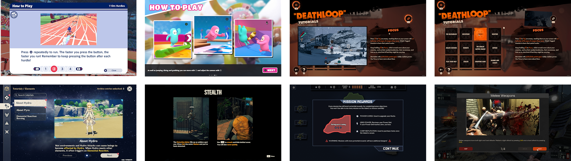
UX researches for the feature – I looked at a lot of different games to see how they made their tutorials
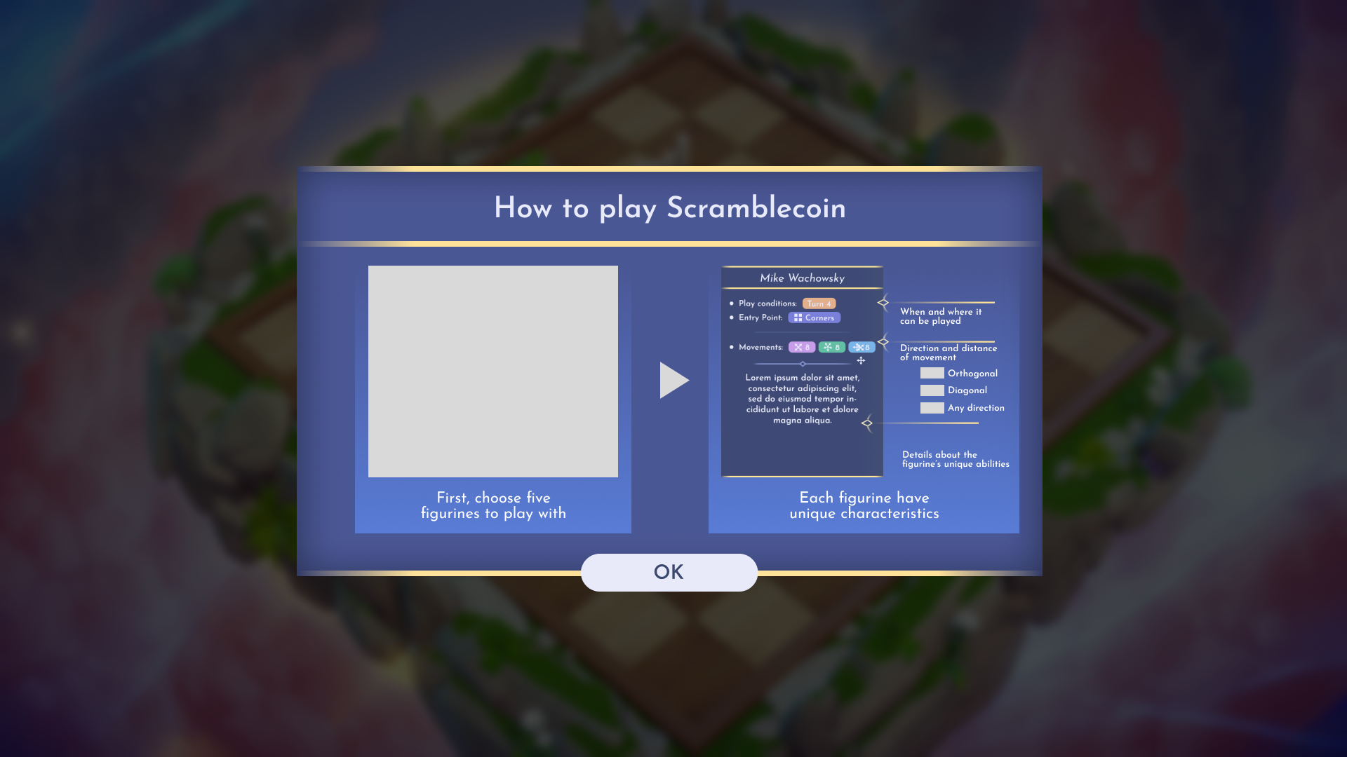
First UX proposition for the popup: way too much information for the player to digest
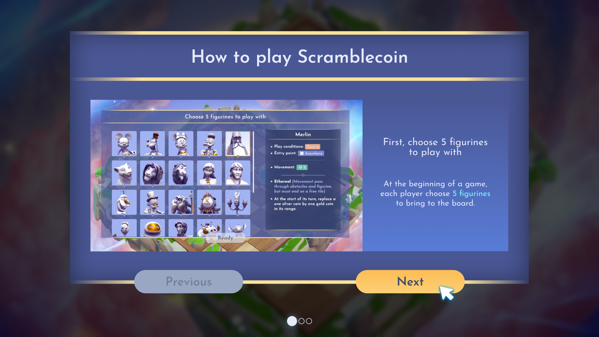
My solution: divide the tutorial into smaller chunks to make it easier for players to retain information.